Neon: Upgrade Flow Redesign

Overview
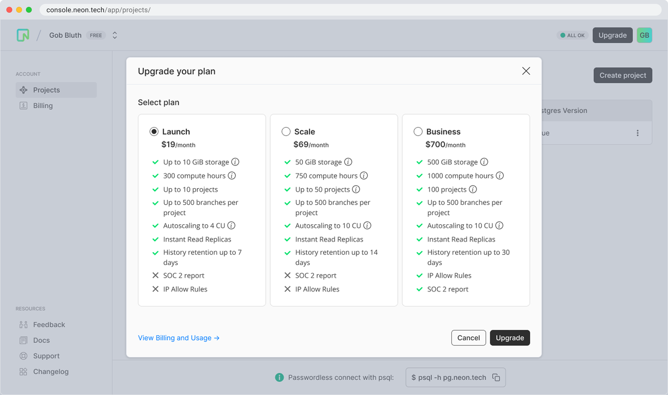
Neon’s pricing model was confusing for new users. The upgrade flow blended all tiers together with weak visual distinction, unclear value propositions, and multiple steps before committing—resulting in user hesitation and churn. This growth-focused case study highlights how design clarified value, promoted the Business tier, and created a more confident path to conversion.
“Design can be a growth lever when it reduces friction and amplifies value.”
My Role
Head of Design @ Neon
I led the end-to-end redesign of Neon’s upgrade experience:
Key Responsibilities:
- Identified friction through user data and behavior analysis
- Led competitive audits to benchmark pricing UI patterns
- Designed and prototyped a clearer, streamlined upgrade modal
- Collaborated with Growth PM, Engineering, and Brand
- Defined hypothesis, shipped A/B test, and measured impact
The Problem
New users were faced with a cluttered, multi-step upgrade experience:
- Weak visual hierarchy made it hard to parse tier differences
- Key value props weren’t clearly mapped to user needs
- Users had to select a tier, click upgrade, and still confirm—a slow, indirect flow
“Users didn’t understand what they were paying for—or why it mattered.”

Quantitative Signals
Friction showed up clearly in the data:
15%
Converted to paid tier within 1 week
2%
Upgraded to Business Tier
47%
Abandoned mid-upgrade
Goals & Alignment
User Goals
- Understand what each tier offers—and why it matters
- Confidently choose the best fit for their needs
- Avoid hidden costs or surprises
Business Goals
- Increase upgrade conversion, especially to Business tier
- Position Neon as a flexible platform that scales with customers
- Reduce friction and build trust at key monetization moments
Hypothesis
If we increase the distinction between pricing tiers and clarify the value of each, especially Business, we will drive higher upgrade confidence and improve trial-to-paid conversion.
Competitive Analysis
Benchmarked ~8 SaaS products to distill upgrade best practices:
- 🧭 Simplify choices – Focus on key differences, not full feature grids
- 🚀 Promote Smart Defaults – Use “Recommended” tags to guide selection
- ⚡ Enable Speed – Minimize steps to upgrade; avoid deep checkout flows
- 📊 Be transparent – Surface billing details, remove surprises
- 💬 Keep it human – Friendly copy builds trust in pricing moments
These patterns guided our upgrade experience redesign.
Proposal – Improved Upgrade Modal
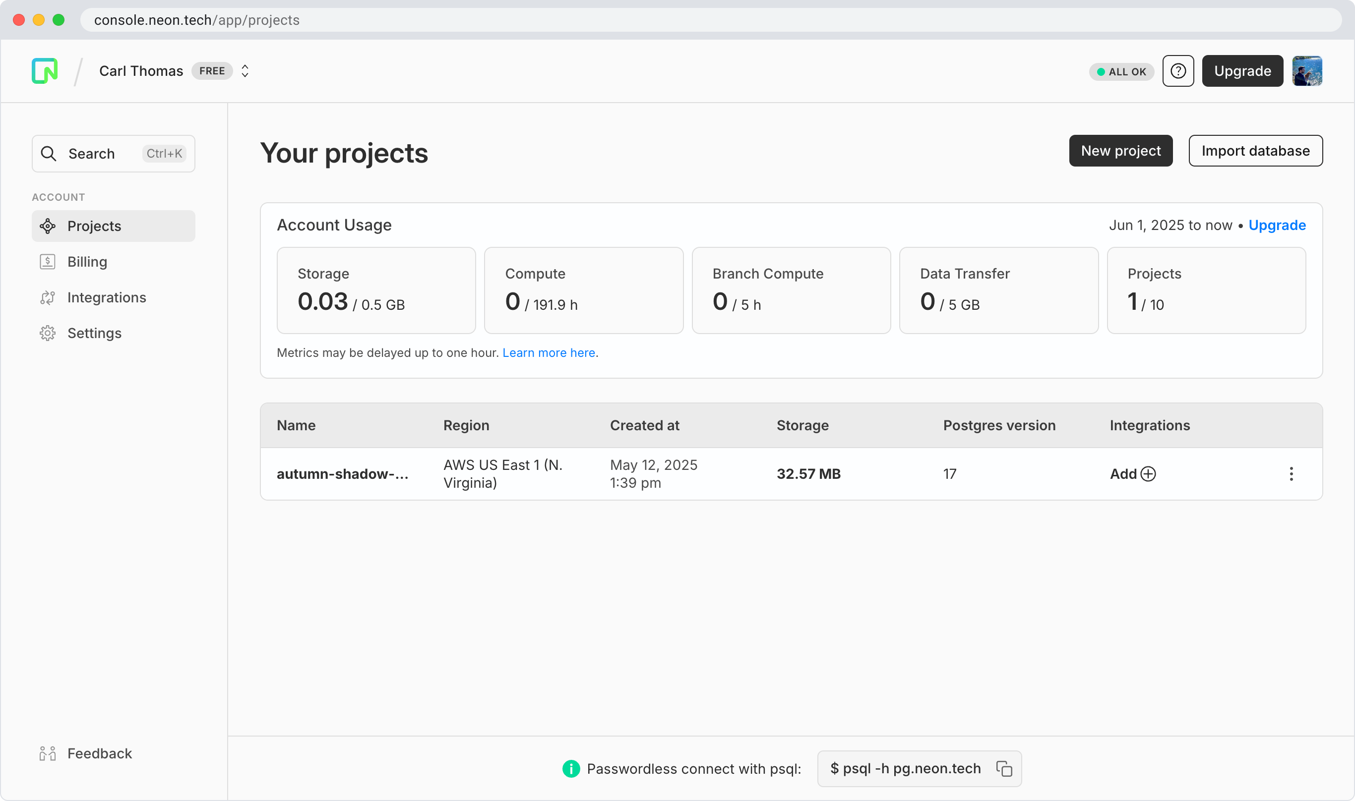
Redesigned upgrade modal with clearer hierarchy, smarter defaults, and stronger cues:
- ✅ Tier Clarity – Strong type hierarchy and simplified content
- ✅ Recommended Tag – Tier tagged based on user behavior
- ✅ Billing & Usage Visibility – Users can view current usage before upgrading
- ✅ Sales Contact CTA – Contact sales CTA for enterprise-scale customers
A clean modal that respects user time while driving monetization
Measurable Outcomes
Released in October 2024
Established the strategic direction for all pricing and upgrade workflows. The design and content was adopted by Neon’s Marketing and Billing teams as they redesigned how current and future customers consume our pricing tiers.
- ✅ +7% increase in paid conversions
- ✅ Fewer support tickets about pricing confusion
- ✅ Business Tier adoption improved notably among activated users
Reflection
Design isn’t just about aesthetics—it’s a tool for alignment, trust, and business impact. This project showed how strategic UX can:
- Reduce churn
- Improve product-led monetization
- Lay the foundation for broader strategic growth conversations
“Design drives business when it’s focused, measurable, and user-centered.”


