Android Studio: Layout Inspector 2.0

Brief

Debugging and iterating on UIs should not be difficult. This project aimed to make the process easier, faster, and all-around better by adding ideal functionalities to the Layout Inspector within Android Studio.

This work would add:

  • The ability to view lifecycle tracking (from initiation through modification)
  • Live editing of your app
  • Improve overall usability of tool
  • Improve performance of tool

My Role

Lead UX Designer, my responsibilities were:

  • Helped established business goals and mapped to user/customer needs
  • Mapped the user flow and designed wire-frames
  • Creating high-fidelity mocks and prototype flows
  • Assisted research team with user studies
  • Run market analysis for App inspectors

Other team members

  • 1 Researcher
  • 1 Technical Writer
  • 2 Project Managers
  • 2 Engineers

Journey

Where we were

The original version of Layout Editor had its issues, often issues reported by users through bug filing and from a research study my research partner and I conducted.

Issues we found were:

  • Does not map 1:1 with Layout Editor
  • Layout Inspector is not easy to discover, leading to low usage and adoption
  • Inspect was creating snapshots by default, this could negatively impact APK size which would in turn impact app success.
  • Inspector was lagging behind its competitors, in terms of capabilities and value. (Main competitor being xCode)

Outlining pain points and OKRs

Customer pain points

  • Inspector creates confusion since it is not 1:1 mapped with the layout editor
    • Inspector uses actual pixels instead of DP (Density-independent pixel). When devs work in Android Studio they work with DP.
    •  Inspector doesn’t reflect the themes/styles set within XML and has no way to trace back to the devs code.
  • The Tree View is overloaded with less important information. Making it difficult to read and use.
  • Inspector is hard to find.

OKRs / User experience goals

  • Give developers complete, live insight into what’s happening in their app’s UI
  • Allow faster iteration for both developers and designers on UI without having to re-deploy the app with each change
  • Improve overall discoverability and utilization of inspector.

Market Analysis

To understand how other leaders analyze apps and web products I opted into different dev tools, reviewed their process, and captures the methods used to analyze layouts. The right shows the top 3 examples that were leveraged to create Layout Inspector V 2.

Competitive analysis covers:

  • Google Chrome – Dev Tools
  • Flutter – Inspector
  • Xcode – Inpsector

Optimizing Inspectors User Flows

Based on our teams research and what I was seeing in the market it was clear the way users move to and from the inspector was not ideal. To fix this I spent a cycle analyzing our current flow, how it works for our competitors, and re-establishing a new flow that would better connect with our users.

Original Flow

New Optimized Flow

A key reality was that we often had users bouncing in and out of the inspector to complete simple tasks. This new flow looks to remove all that noise and connect the inspector directly to the emulator. This method is similar to how Chrome dev tools work today and other industry-leading dev inspection tools.

High fidelity solutions

Below breaks down some of the key solutions that I created to solve the above user problems and goals. I focused on what was done given specific NDAs within Google. Please reach out to me if you’d like more context.

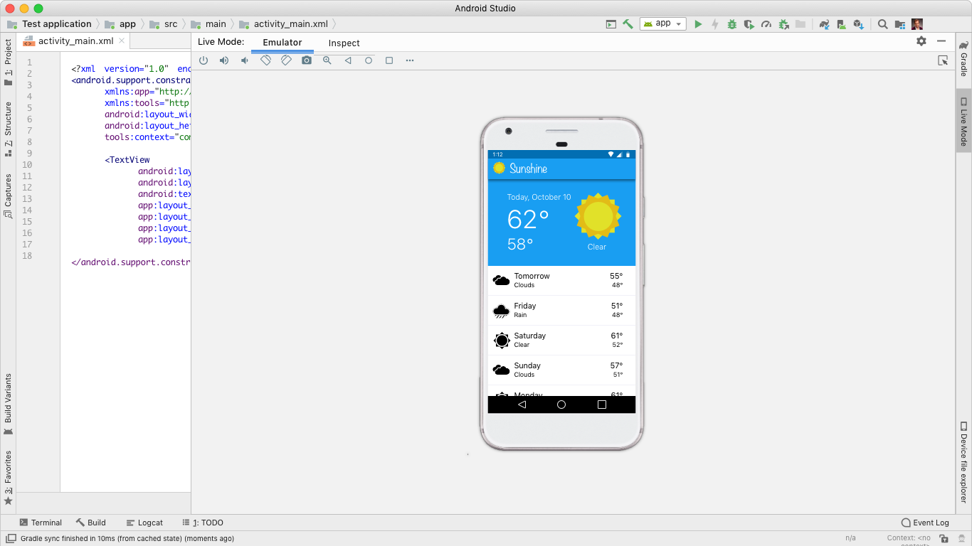
1 – Tool window view with an attributes focus

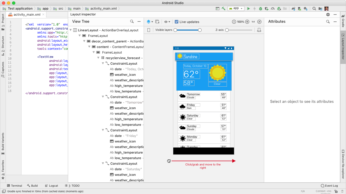
Developers use the Layout Inspector to debug visual oddities and bugs in their Android apps. The Layout Inspector needs to mimic what is live or emulated in Android Studio, and it needs to show information that connects to how the app is coded.

I created a tool window view that achieves these goals. The tool window view maintains the Layout Inspector’s original 3 vertical panels, but it no longer takes over the entire screen. This allows developers to run the Layout Inspector side by side with their code or in a separate window. This is a common method used by other inspector tools, and it enables rapid iteration and validation from a coding layer.

I also replaced the original content in the attributes panel with more consumable information. The original content showed literal post-rendered metadata, which gave positional information based on how the device recognized the location of the view. This was not helpful to developers, who want to see the information that they coded. The new attributes panel shows the actual layout attributes of the view, which is much more helpful for debugging.

This new tool window view makes it easier for developers to debug visual oddities and bugs in their Android apps. It is a valuable tool for any Android developer who wants to create high-quality layouts.

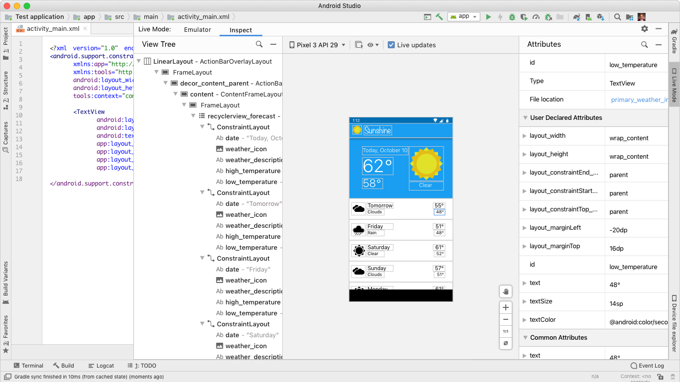
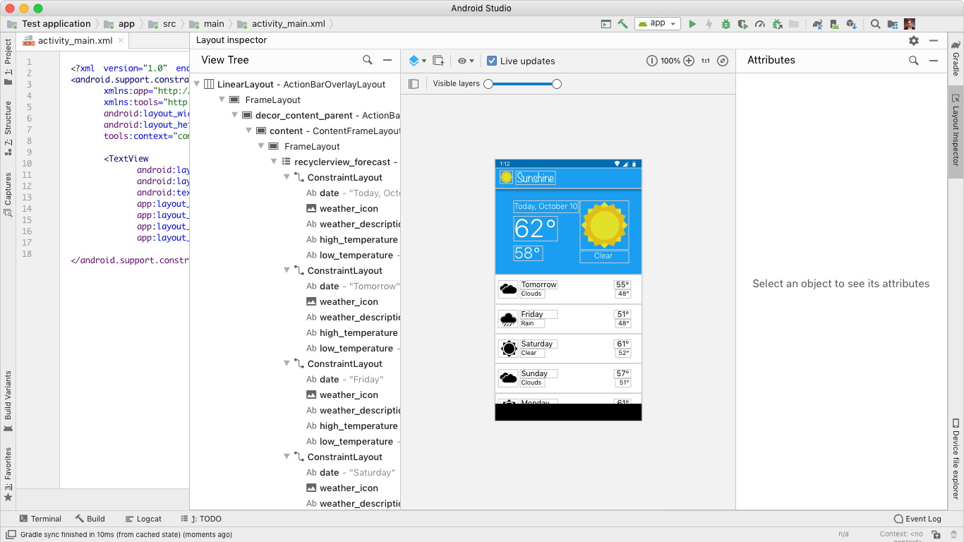
This flow shows a user going from the android studio emulator into the layout inspector by clicking on an element. This new flow enabled developers the ability to quickly iterate and discover any issues with their app.

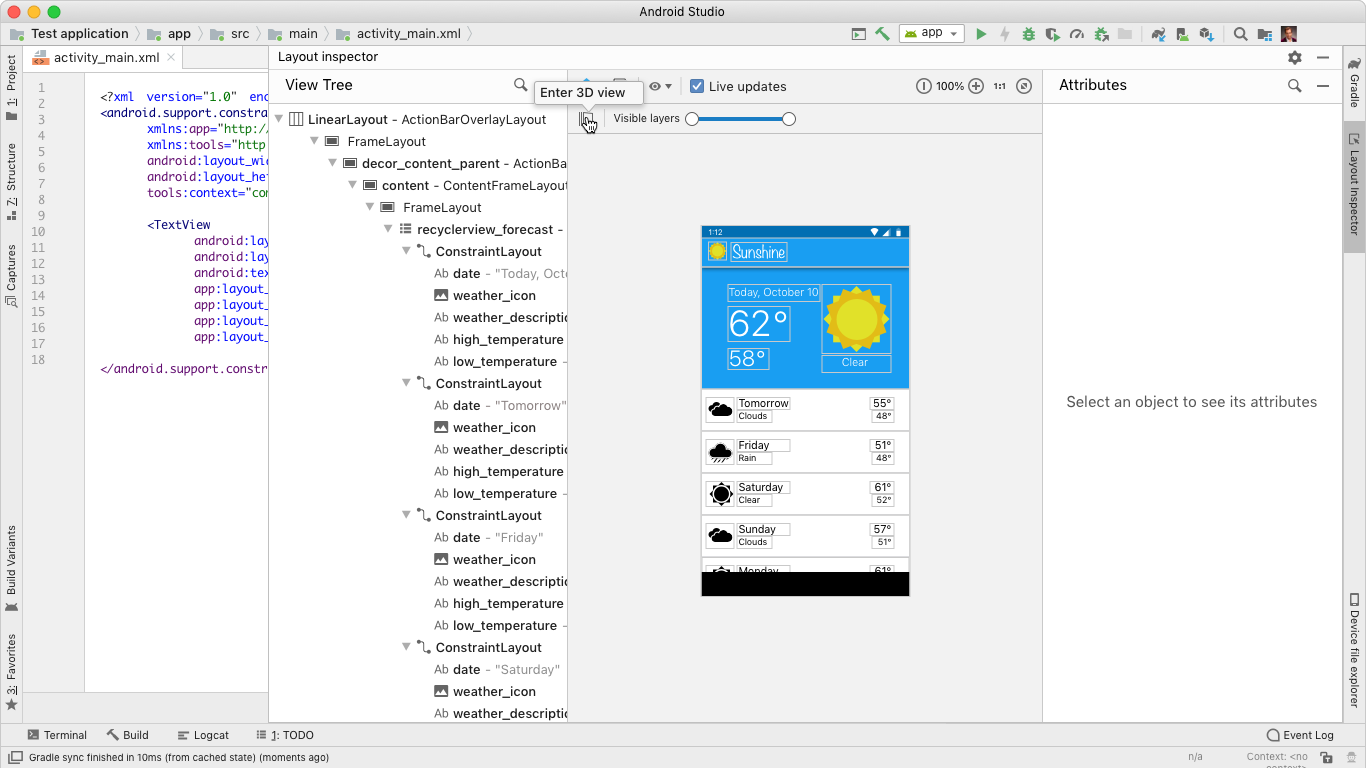
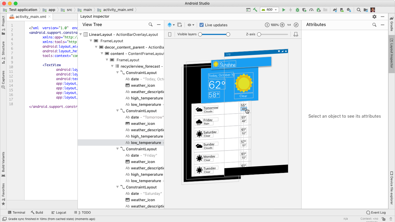
2 – Using 3D modeler to find issues

A new aspect of the Layout Inspector is the ability to adjust the view of your App within a 3D space. This enables developers the ability to find issues or any oddities that exist within the App, issues that would be difficult to see in a 2D view.

As you click through this flow you will see how a user can go from 2D view to a 3D view, leveraging a few different methods:

  • Dragging into a 3D view
  • Toggling 3D / 2D views
  • Viewing App hierarchy
  • Clicking items nested within a screen

Breaking down the new Inspector

With this design I was fundamentally changing how components within the Layout Inspector worked and could be interpreted by the user. Below we will go over the key areas that were changed and how the design breaks down, based on user engagement.

1 – Inspector Overview

Below you can view how the Inspector is broken down from the top level. Each section focuses on key details of the app. This layout had maintained the original structure of the layout inspector given that it met the users expectations for inspection tools.

  1. View Tree Panel: Showcases the structure of the app, this structure matches 1:1 of how the app would execute.
  2. Screen Viewer: How the app will render live
  3. Attributes Panel: This table view provides attributes and metadata of a selected item.

2 – Breaking down the Attributes Panel

A major update to the Inspector was the Attributes Panel, this required reassessing the types of data shown as well as how we render changes.

3 – Breaking down the 3D modeler

A new aspect of the Layout Inspector was a 3D modeler. These are leveraged by the developer to see the layering and alignment issues within their App.

Below you can see a further breakdown of additional ways the user can optimizer the modeler.

Outcomes

This feature was released in Canary early 2020 and went to stable May 2020

When this feature launched, for 3.5 Canary, it found a lot of positive reviews within the canary community. Many remarking on how it improved their debugging workflow. Here are some unofficial announcements/promotions by those canary users: