Below breaks down some of the key solutions that I created to solve the above OKRs. I focused on what was done given specific NDAs within Google. Please reach out to me if you’d like more context.
1 – Enabling resource import and multi-resource creation
When we look at what happens during a resource creation, we needed to understand the hand-off between the android app developer and their designer. Typically it follows this flow:
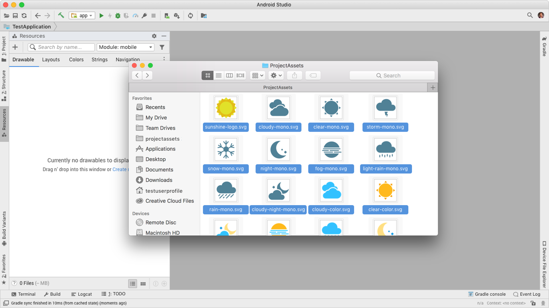
- The designer would provide their developer a vector formatted asset (typically SVG)
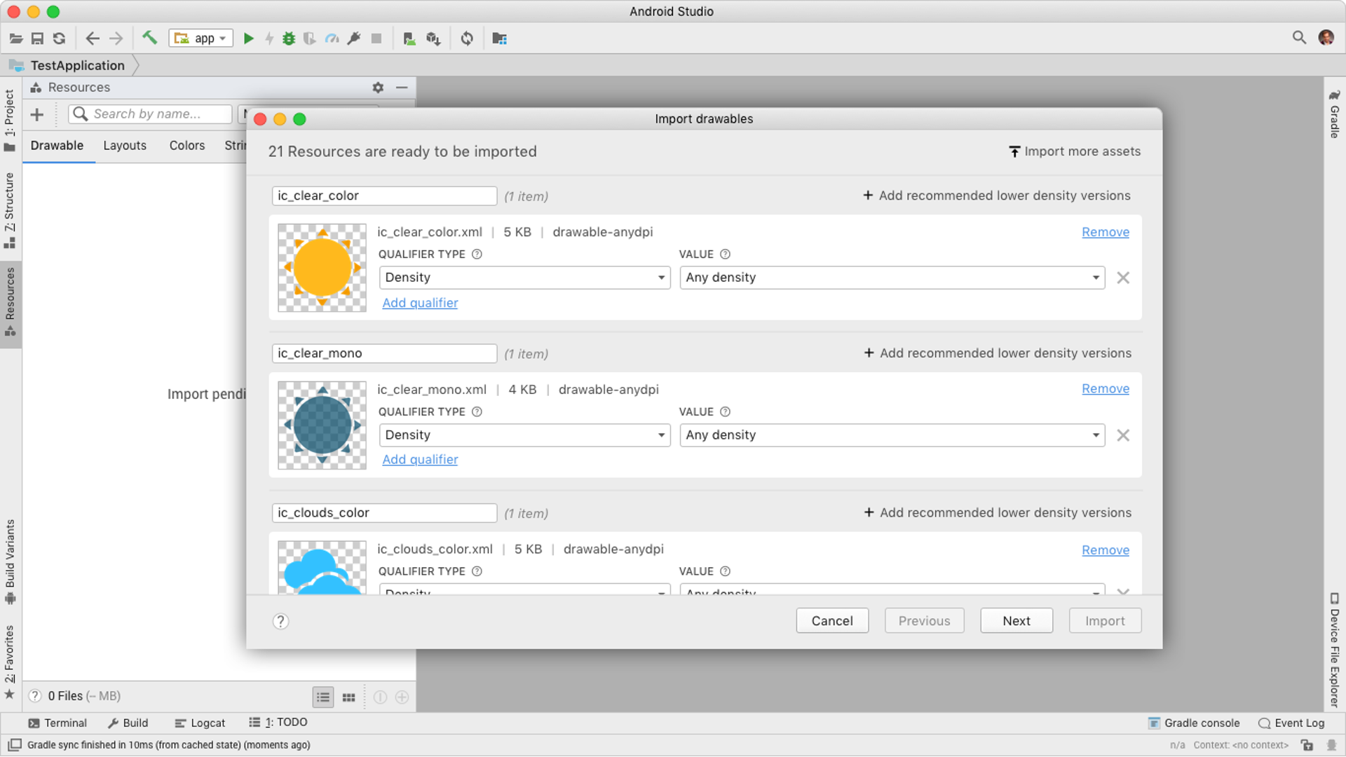
- The developer would need to converted he provided asset into an .xml file. These are the types of resource files that work within an android app.
- If the app is going to be working cross region or across multi device the developer would also have to create different “densitys”. This refers to a resource having different files to support different devices, it is done to optimize app load time pending on the location. Big example is less high res versions being used for low end devices in third world locations.
- Dev would repeat this process for every asset.
If you take this flow and expand it to how many icons, visuals, animations, strings, colors, etc that are part of an app you can imagine that this can take a long time. It is also time that often is not rewarding to the developer, instead becomes busy tedious work.
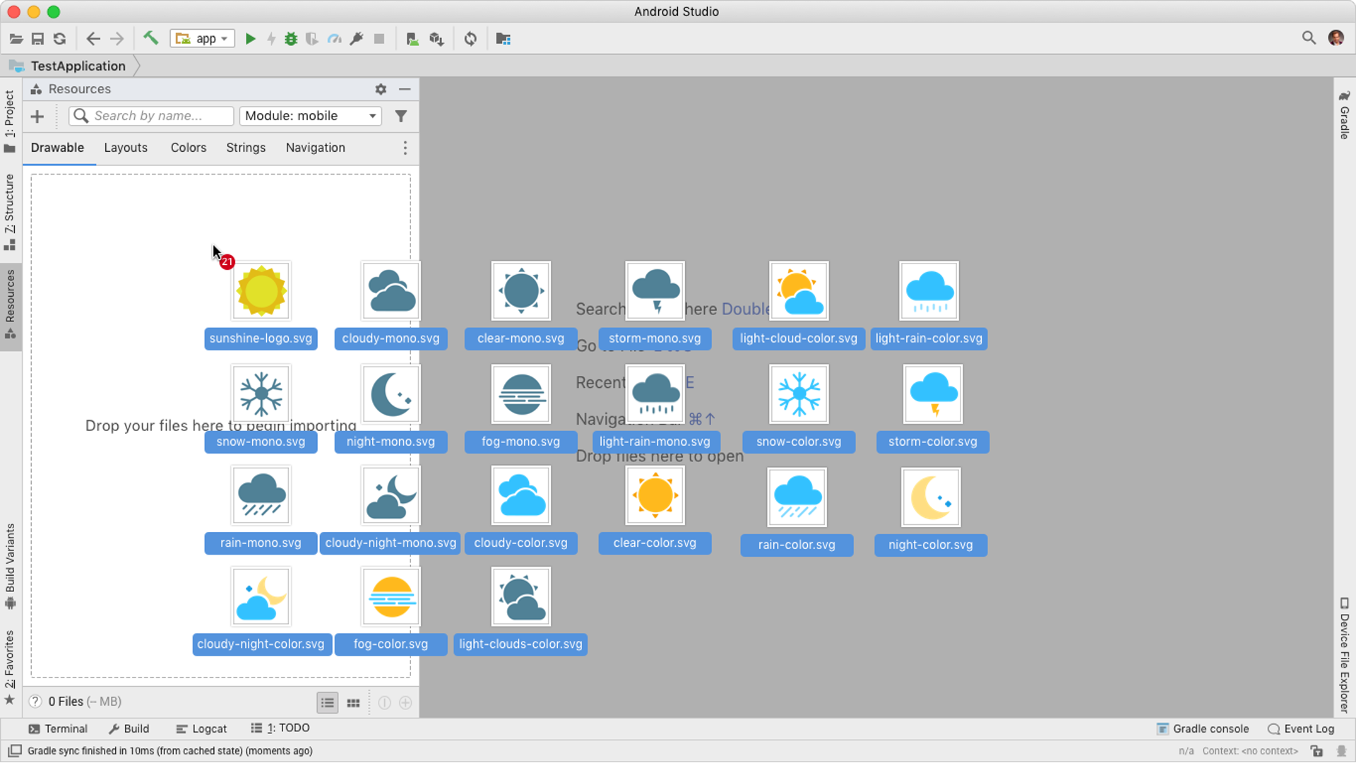
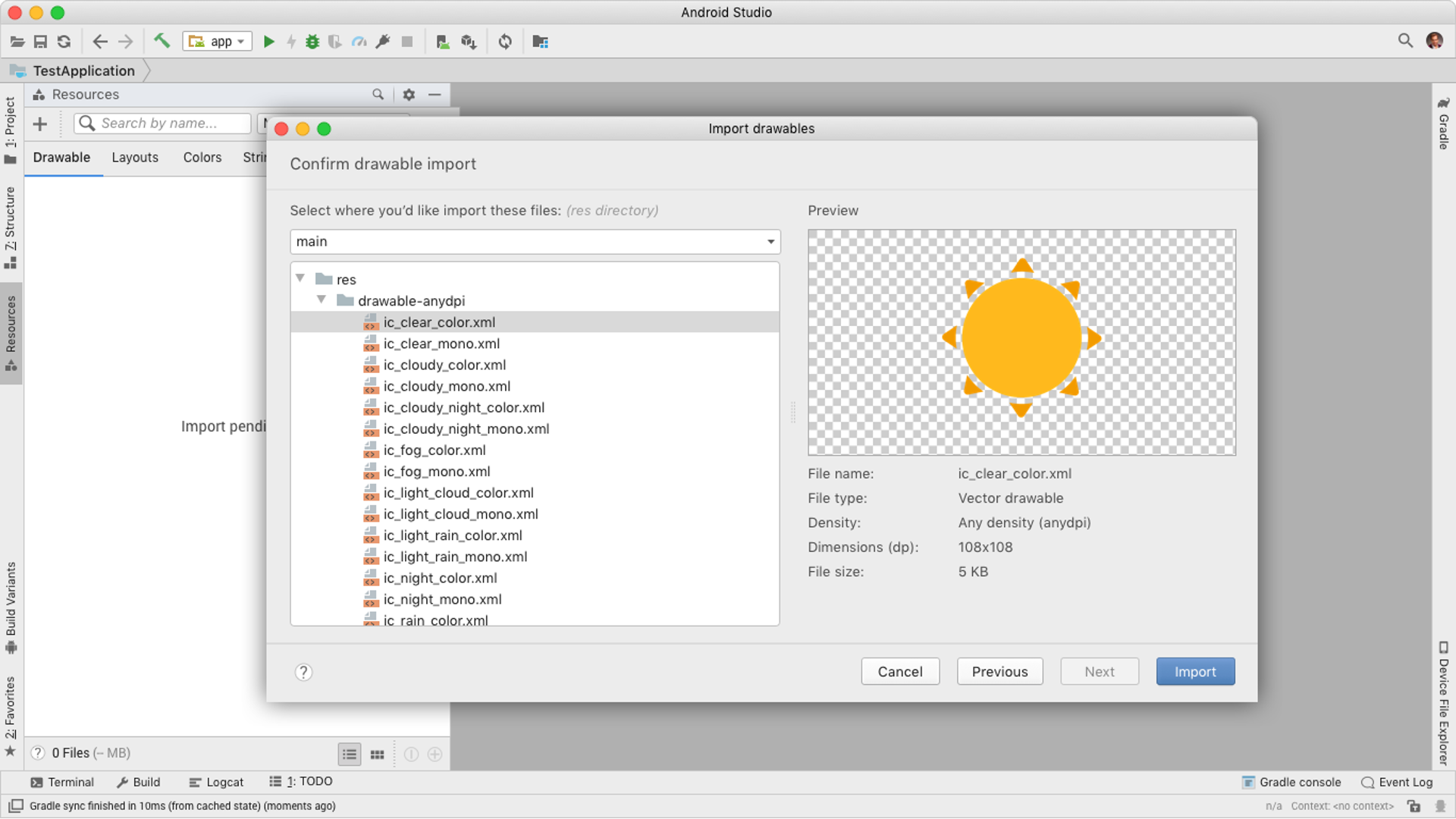
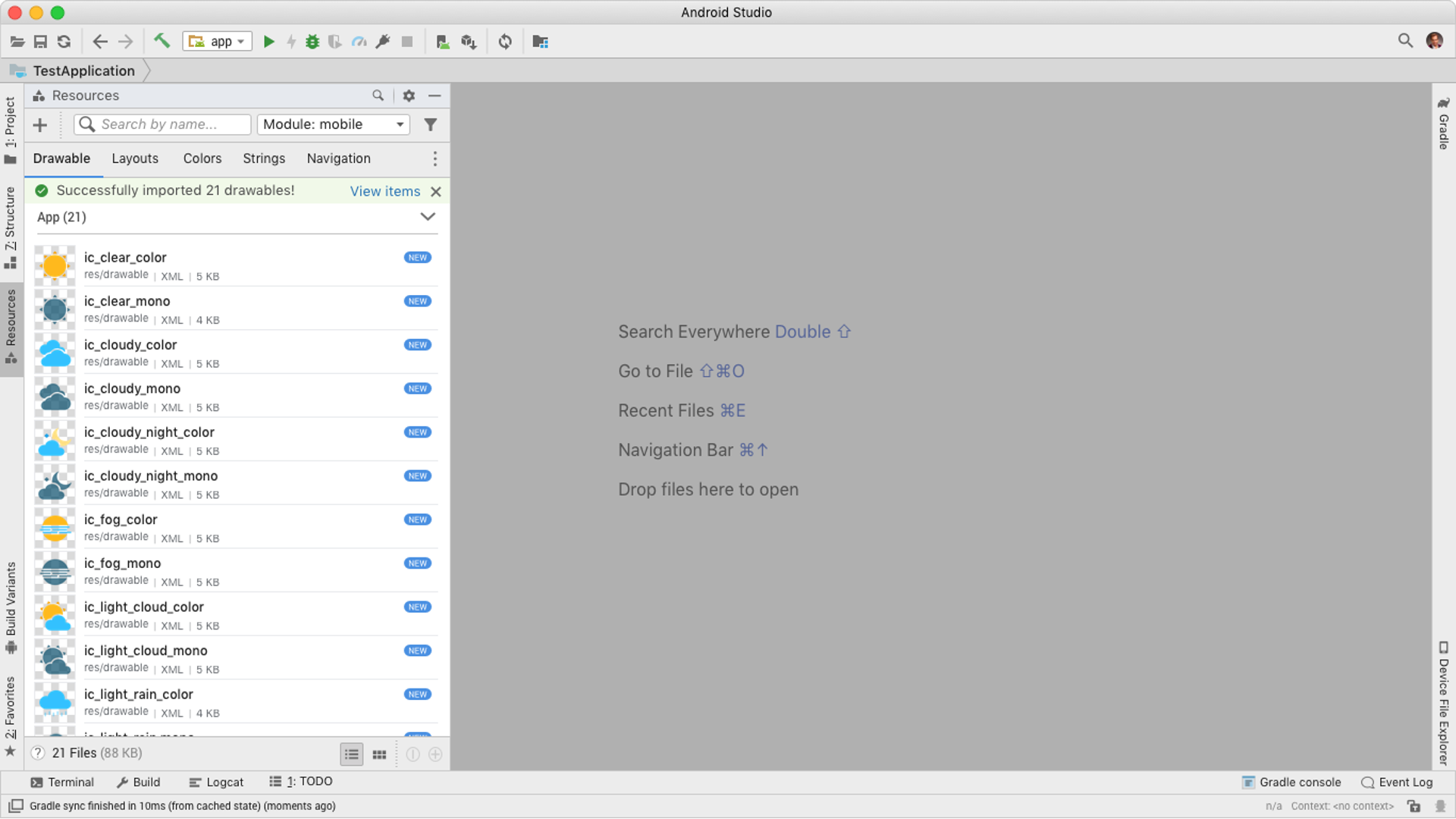
So, in order to solve for key user pain points and the P0 OKR, I designed an importing flow that would enable developers to easily drag and drop or bring in all resources needed for their android app.
This workflow does that for the developer and prevents them needing to do the heavy lifting.
This flow leveraged industry standard concepts as well as optimizing around direct feedback from our customers. They want to spend little time on doing this and leave it all on bringing in what their designer provided.
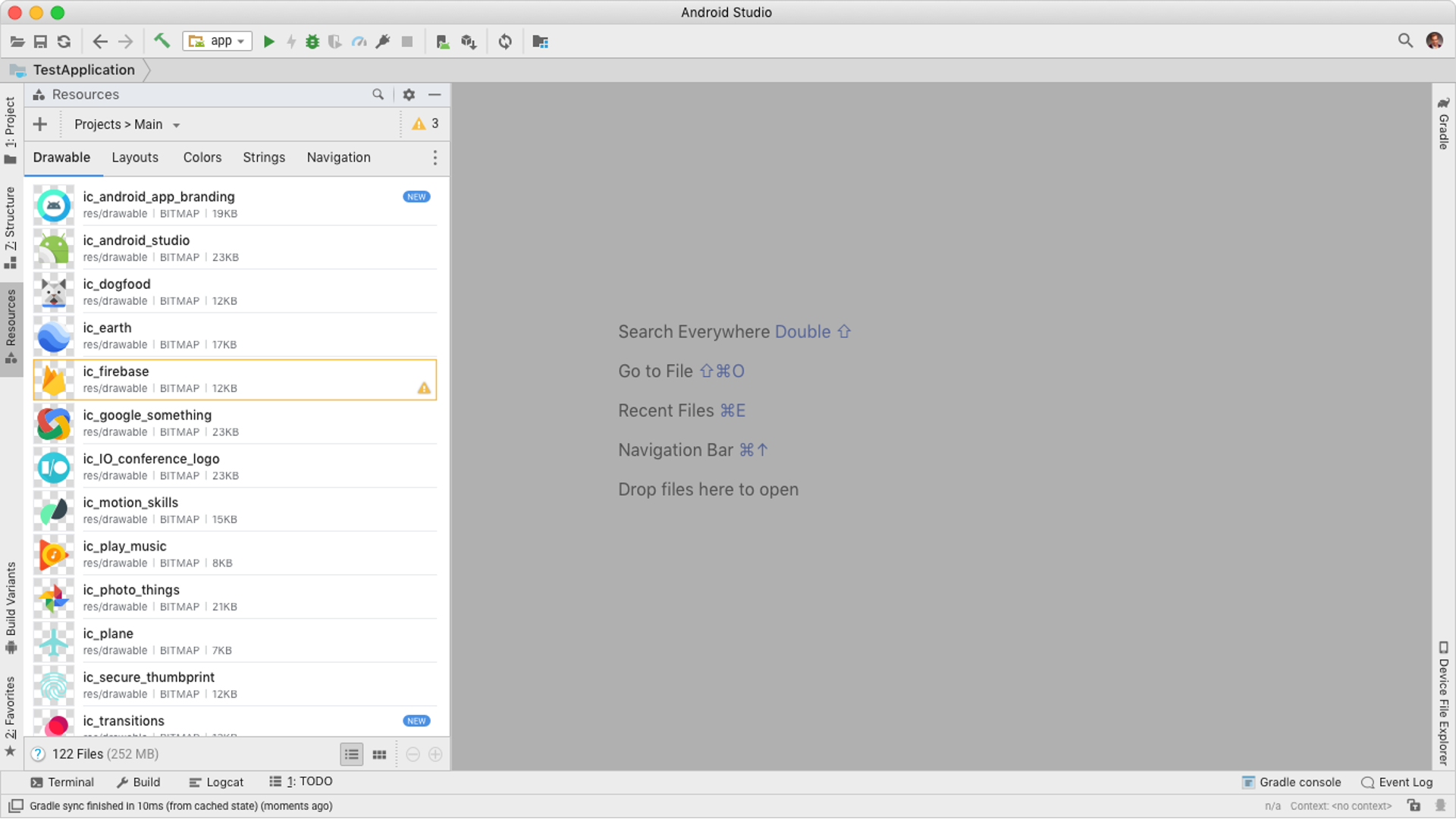
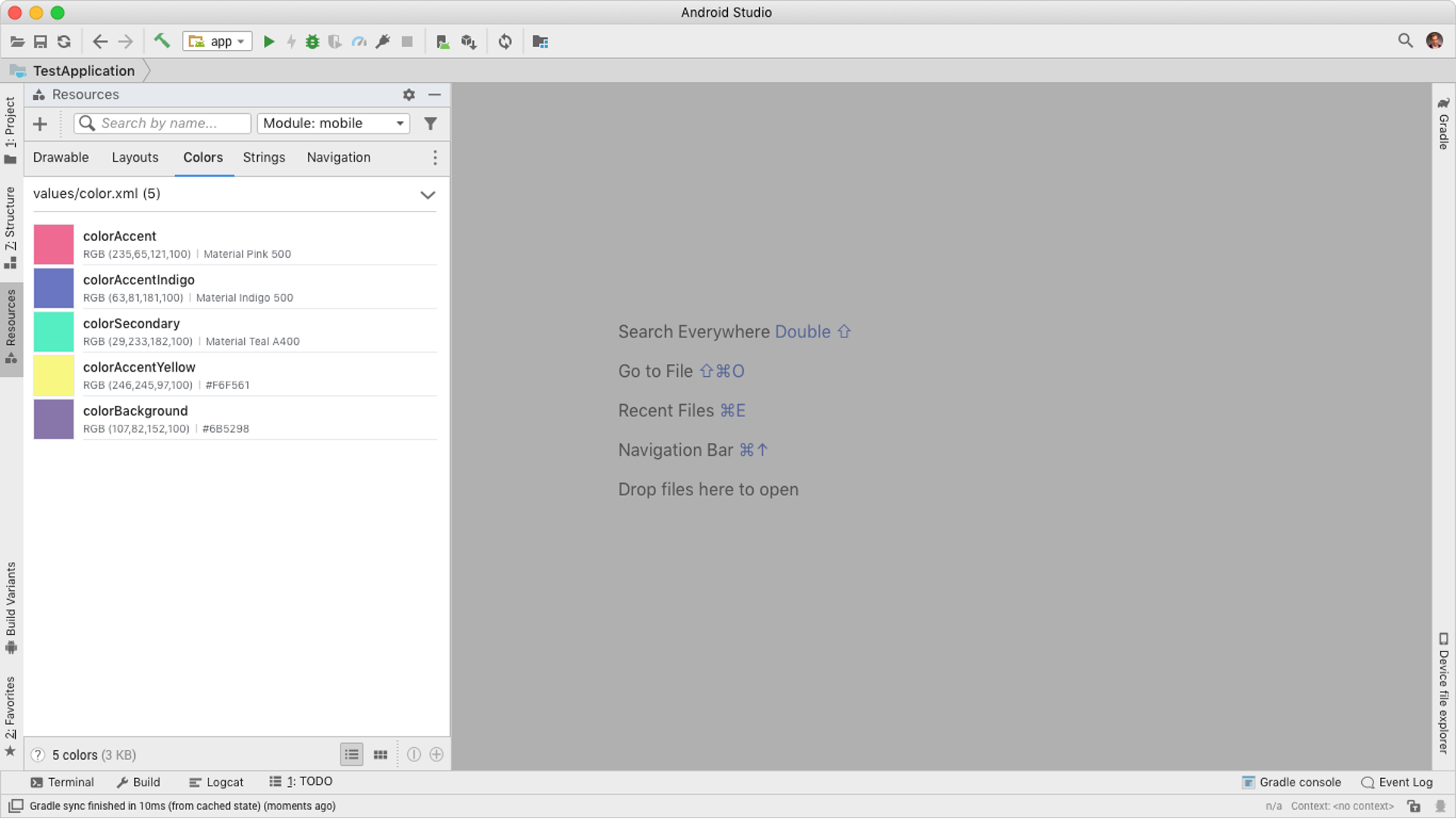
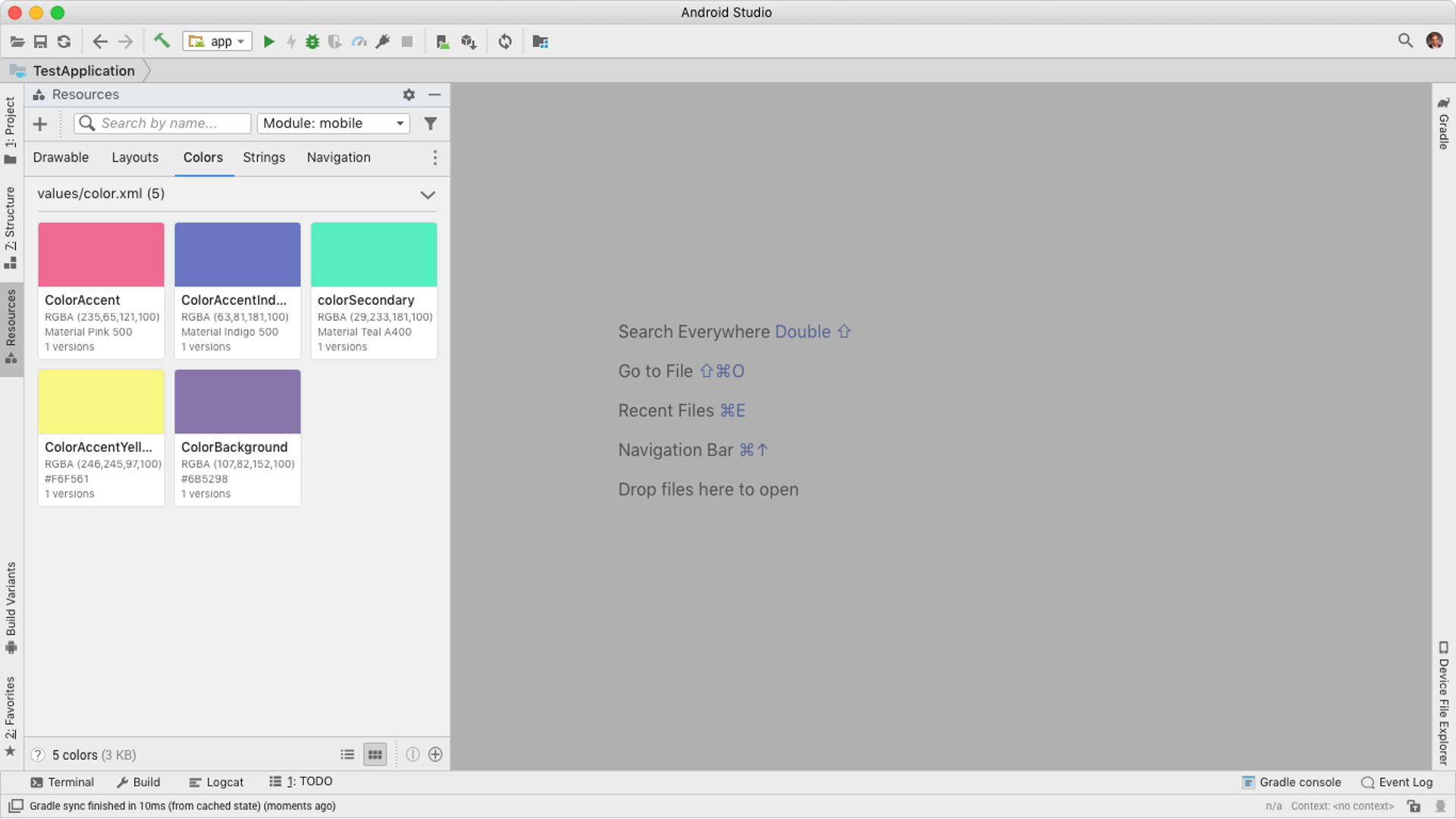
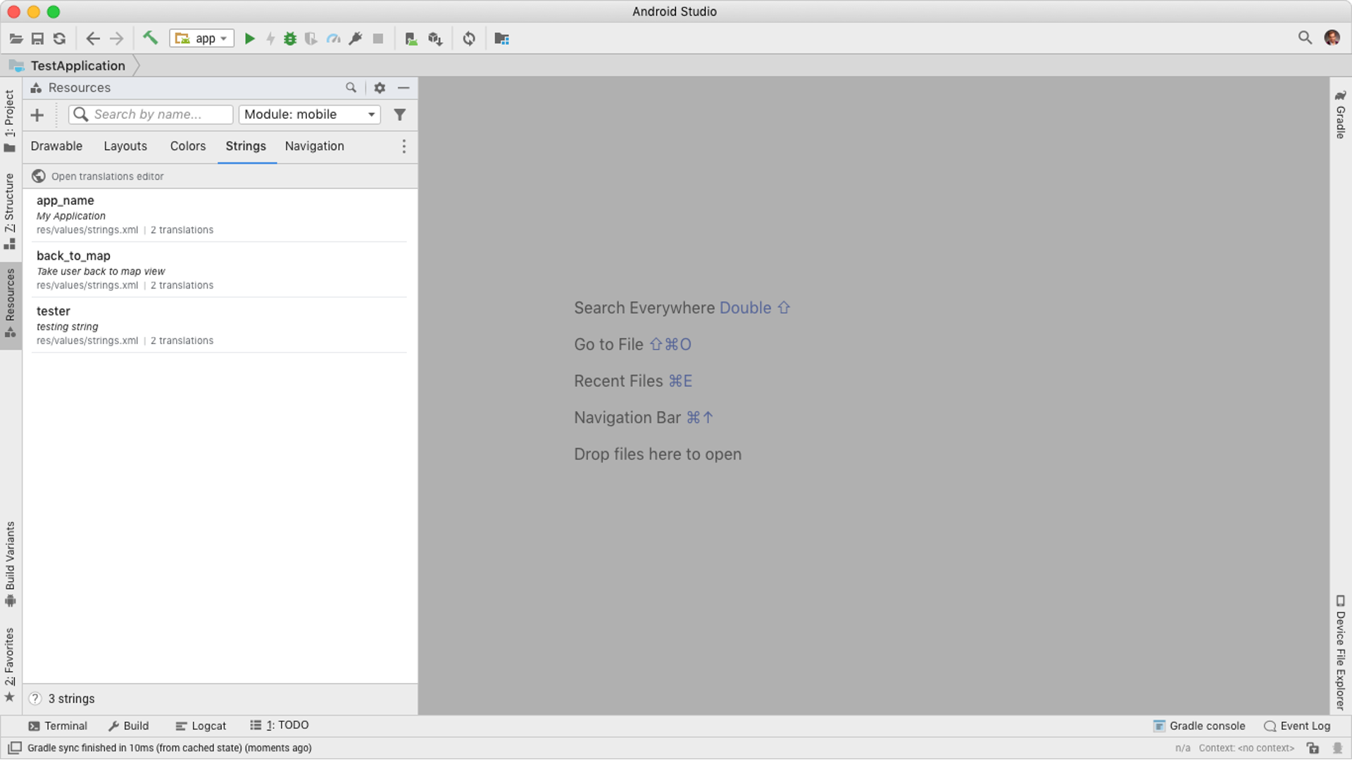
2 – Viewing and managing existing resources
Now that the developer has imported all resources they will need an intuitive way to view and leverage them within their app. Below showcases the experience I designed which focused on providing an interactive and visually informative panel within Android Studio.
The use of a panel falls standard guidelines within our product ecosystem as well as enabled developers a simpler more intuitive way to interact with their assets. You will notice this panel has multiple tabs within it and the slides below will go through some of them. The reason behind this is because resources within android include but not limited to: Drawables (icons), layouts, colors, strings, navigation, Style, and font.
The organization of the tabs was determined by usage over time, focused more on what is high usage and continued usage over time.
With this design I had to create a new tile and list pattern that would maintain its clarity and usability with different screen sizes, panel size changes, and resource types. A key aspect focused on how you showcased different resource types within the same view, even a resource like drawables can have different variations of a drawable and each would have different use cases.
1 – Breaking down the list
Here I am showcasing how different drawables can be represented within a list component as well as as how states can play a part within a list. States like warning, hover, clicked, and new.
2 – Breaking down the tile
Along with the list views we needed to support the tile view itself. Ensuring it worked across a range of tile sizes and requirements.
Along with know how a tile can look we needed to know how a tile would react to size changes. These changes can be caused by adjusting the size of the resource panel, android studio itself, or from accessibility settings.